Iconic Kyoto and Nara Motifs: Top Visual Ideas for Excursion Booklet Covers

Every spring and autumn across Japan, secondary school classrooms hand over an essential creative mandate to their student planning committees: designing the cover of the shiori, the official excursion guidebook. For the classic four-to-five-day journey through the Kansai region, this small booklet coordinates train transfers, lodging rules, and historic temple walking routes. The cover illustration sets the emotional tone for the entire trip, balancing reverent heritage with teenage camaraderie. As highlighted in a recent ナタリー Report, which detailed writer Masaya Tsunamoto and artist Demo's sci-fi mystery manga Shuugakuryokou: Kyoto Nara 4-paku 4-ka serialized in Bessatsu Shonen Champion, the shared cultural memory of navigating Kyoto's bus loops and Nara's deer parks remains one of Japan's most fertile creative touchstones.
Translating this multi-day excursion into a single piece of cover art requires specific compositional strategies. Student illustrators must balance complex temple silhouettes with clear typography, all while working within the harsh contrast limits of black-and-white risograph printing.
📌 Quick Summary:
- Visual Hierarchy: The most successful covers combine one Kyoto architectural landmark with one Nara wildlife motif rather than crowding every temple onto a single page.
- Production Reality: Over 85% of Japanese school guidebooks are reproduced via single-color mimeograph or budget school copiers, requiring crisp black-and-white line work over soft grays.
- Modern Aesthetic: Contemporary designs pair traditional geometric patterns (*wagara*) with clean manga character art to keep official itineraries feeling fresh and student-led.
The High School Rite of Passage Behind the Shiori Tradition
In the Japanese secondary school system, an excursion is not simply a vacation; it is an exercise in collective discipline, cultural education, and student autonomy. Weeks before departure, the school trip planning committee assigns dedicated editorial crews to draft, format, and assemble the shiori. This booklet contains room assignments, emergency procedures, walking routes, and reflection journal pages.
Because the cover represents the face of the entire grade's shared experience, schools routinely run internal design contests to select the winning artwork. Students vote on entries submitted by their peers, frequently picking drafts that blend inside classroom jokes with quintessential Kansai landmarks. The final cover is run through school risograph duplicators on colored cardstock, often pale yellow, light green, or pastel pink, creating an immediate souvenir that students preserve long after graduation.
Historic Monuments Reimagined: Golden Pavilions and Sacred Torii Gates
Kyoto offers an overwhelming inventory of visual markers, but three architectural staples dominate student sketchbook submissions. Selecting the right structure depends entirely on the composition's focal point.
A Kinkaku-ji Golden Pavilion sketch serves as a reliable anchor for upper-half cover layouts. Its layered eaves, delicate fenestration, and rooftop bronze phoenix provide vertical weight. To prevent the complex timber framing from muddling under high-speed school copiers, artists strip away minor details, focusing strictly on high-contrast roof profiles and clean horizontal lines.
[ Kinkaku-ji Phoenix Silhouette ]
/===============\
/___\
/===================\
/_\
For covers prioritizing depth and perspective, Fushimi Inari torii gate art remains unmatched. Illustrators use receding vermilion posts to establish strong vanishing lines, framing student silhouettes walking down the mountain trail. Meanwhile, Kiyomizu-dera landmark drawings leverage the massive timber scaffolding of the main stage (butai), positioning the temple precariously above billowing cherry blossoms or maple branches. These classical architectures ground the booklet in historical gravity before youth elements take over.
Sacred Deer and Chibi Mascots: Injecting Youthful Energy
If Kyoto provides architectural discipline, Nara injects humor and life. The free-roaming sika of Nara Park are central to almost every cover draft.
Rather than drawing photorealistic wildlife, student committees lean heavily into Nara park deer illustrations drawn with rounded, expressive features. These sacred messengers are frequently depicted bowing politely, nibbling on school uniform blazers, or aggressively pursuing terrified student caricatures clutching stacks of shika-senbei (deer crackers).
Integrating chibi mascot and character art balances the serious aesthetic of heritage sites. Drawing classmates as miniature, super-deformed characters lounging beneath the Great Buddha of Tōdai-ji makes the booklet approachable. These mascots often mirror the specific clubs within the school, a runner with a track baton, a student holding an art palette, or musicians carrying brass cases, ensuring the artwork reflects the specific grade level carrying it.
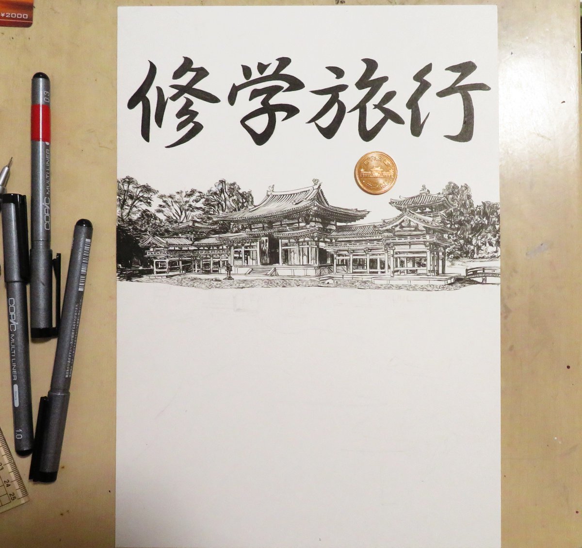
Production Realities: Riso Printing, Halftones, and Line Weights
Designing for a school publication differs sharply from drawing for digital screens or full-color art books. Budgets dictate that the vast majority of shiori booklets are duplicated internally on single-drum digital duplicators (commonly RISO machines) or standard monochrome office copiers.
Delicate digital pencils and subtle gradient washes do not translate well to budget paper. Tonal gradients turn into patchy, uneven digital artifacts when copied at high speeds. Consequently, seasoned student illustrators rely on pure black-and-white printable artwork. Solid black fills (beta-nuri), sharp ink outlines using 0.5mm to 0.8mm technical pens, and clean stippling produce the most reliable results.
| Visual Style | Inking Technique | Duplicator Legibility | Typical Cover Tone |
|---|---|---|---|
| High-Contrast Woodblock Style | Heavy brush pen fills with thick contour lines (0.8, 1.2mm) | Exceptional: Zero risk of toner breakup or banding | Solemn, traditional, artistic |
| Modern Manga / Chibi Line Art | Uniform fineliner (0.3, 0.5mm) with crosshatch shading | High: Crisp texturing; avoid fine dot halftones | Energetic, comedic, approachable |
| Watercolor / Pencil Emulation | Soft digital airbrushing and light gray shading washes | Poor: Duplicators smudge gray tones into muddy blotches | Nostalgic, gentle, literary |
When shading is required, creators use standardized physical or digital screen tones set below 45 lines per inch (LPI). Higher line frequencies cause moiré interference patterns when processed through basic school scanners.
Composition, Typography, and Traditional Wagara Accents
A visually appealing illustration fails if it obscures the necessary trip information. Cover artwork must leave dedicated negative space for primary titles: the school name, the academic year, the grade division, and the excursion dates.
Balanced cover layout and typography design generally divides the B5 or A5 page into thirds. The central third hosts the narrative illustration, while the header and footer carry bold lettering. Hand-drawn kanji titles, often rendered in a squared Kanteiryu (kabuki theater) or stylized brush gothic script, give the booklet a unified hand-crafted identity.
To bridge modern pop art with classical aesthetics, illustrators frame the composition using traditional Japanese wagara patterns:
- Asanoha (Hemp Leaf): Geometric triangles symbolizing healthy growth and resilience, commonly run along the spine margin.
- Seigaiha (Blue Sea Waves): Concentric overlapping semicircles signaling tranquil waters, ideal for bordering lower sections near Kamo River sketches.
- Ichimatsu (Checkerboard): Alternating filled and empty squares that easily blend into modern graphic compositions without cluttering text zones.
These geometric bands frame the page, turning casual hand-drawn student itinerary templates into unified, publication-grade memorabilia.
Frequently Asked Questions (FAQ)
Q1: What are the best pen sizes for hand-drawing a booklet cover?
A: Use a 0.5mm to 0.8mm pigment fineliner for primary structural outlines and main characters. Reserve 0.1mm to 0.3mm pens strictly for light facial details or distant architectural textures, as lines finer than 0.3mm tend to vanish entirely during high-speed school mimeograph copying.
Q2: How can an artist balance both Kyoto and Nara motifs on a single page?
A: Split the page diagonally or adopt a foreground-background split. Place a bold architectural silhouette from Kyoto (such as the five-story pagoda of Tōji or Kinkaku-ji) in the upper background, and anchor the lower foreground with interactive Nara elements, like an alert sika deer chewing an itinerary corner.
Q3: Should the artwork be made digitally or on physical paper?
A: Both work well, but physical pen-and-ink on smooth Kent paper remains standard. If illustrating digitally on an iPad or graphics tablet, work at a minimum canvas resolution of 600 DPI in pure monochrome (1-bit bitmap) or clean grayscale, and manually threshold the final line art to pure black-and-white before printing test copies.
Preserving School Memories Through Ink and Paper
The enduring charm of the Kyoto-Nara excursion booklet lies in its tactile authenticity. In a school environment increasingly dominated by digital scheduling apps and cloud portals, the printed shiori remains a stubbornly physical object. It gets dog-eared from constant consultation on early-morning Shinkansen platforms, stuffed into daypacks alongside temple entry tickets, and covered in spontaneous handwritten stamps from local stations.
When student illustrators combine bold architectural outlines, expressive character sketches, and time-tested geometric patterns, they do more than design an itinerary wrapper. They produce a lasting creative artifact that captures a pivotal moment of youth, framed against the ancient streets of Japan's historic capitals.
