Visual Guide: Step-by-Step Custom App Icon Setups on iPadOS 18

Apple broke its decade-long design doctrine with iPadOS 18, releasing the tablet's expansive display from the strict top-left snap grid that defined iOS since 2007. As documented in a technical breakdown by the マイナビニュース Report, users can place app icons and interactive widgets anywhere on the desktop canvas, framing wallpapers and establishing visual breathing room without third-party spacer apps. Combined with native icon coloring and advanced automation pipelines, personalizing an iPad workspace has evolved from a clumsy workaround into a robust system feature.
Taking control of your iPad home screen requires navigating two distinct paths: Apple's native icon redesign settings for system-wide color toning, and the Apple Shortcuts app workflow for bespoke graphic packages. Both methods alter how you interact with your device every day. Here is how to configure each approach, strip away system clutter, and build a unified visual aesthetic.
📌 Key Takeaways:
- Native Theming: iPadOS 18 introduces built-in dark mode styles and tinted app icons directly from the home screen editor, matching color palettes to your wallpaper automatically or via a hex-style color picker.
- Total Customization: Replacing default graphics with custom icon PNG assets requires building an Open App action workflow inside Apple Shortcuts, allowing custom typography, themes, and community-designed packs.
- Functional Trade-offs: Shortcut-based custom icons bypass native dynamic badges and produce a tiny system notification on tap, whereas native tints maintain real-time notification counters across all screens.
Breaking the Rigid Grid with Freeform Placement
For seventeen years, adding an icon to an iPad screen meant watching it snap mechanically to the next available slot in an unbroken line from the top-left corner. iPadOS 18 dismantled that constraint. Icons, folders, and aesthetic home screen widgets now anchor to any coordinate on the underlying 6x4 or 6x5 layout grid.
To arrange icons freely:
- Touch and hold any empty area of the home screen until the icons begin to jiggle.
- Drag any app icon or widget to your preferred location, such as the bottom edge for thumb reach, or clustered along the right margin.
- Release the icon. It stays anchored in place, leaving empty rows or columns intact.
This layout flexibility changes how you balance functionality and visual art. You can frame the subject of a family photo or custom illustration without app icons obscuring faces or key artwork. It also enables ergonomically sound tablet layouts, placing high-frequency utility apps near the bottom corners where your hands rest when holding an iPad Pro or iPad Air in landscape orientation.
Native Icon Overhauls: Dark Mode and Tinted Palette Engines
If you want a unified look without downloading external image packs, iPadOS 18 features a system-level personalization sheet. This engine extracts color tones directly from your background wallpaper or lets you dial in a custom accent hue across every installed application.
To configure native icon styles:
- Long-press any blank area on your home screen to activate jiggle mode.
- Tap the Edit button in the upper-left corner of the screen.
- Select Customize from the drop-down menu to reveal the bottom personalization sheet.
- Choose between four visual treatments:
- Automatic: Switches icons between light and dark treatments based on system schedule.
- Dark: Forces dark-toned icon backgrounds across supported native and third-party apps.
- Light: Locks icons into standard bright appearances.
- Tinted: Converts all icons into a two-tone monochromatic style.
The Tinted mode includes two slider tools: a color spectrum bar to choose your primary hue and a saturation slider to adjust intensity. Tapping the eyedropper tool lets you sample any exact color directly from your desktop wallpaper, instantly harmonizing the entire display. Tapping the icon-size toggle switches between standard icons with text labels and a cleaner, enlarged presentation that eliminates app names entirely.
Building Bespoke Visuals Through the Apple Shortcuts Workflow
Native tints provide uniform styling, but they cannot replace standard app logos with custom illustrations, line art, or custom icon PNG assets. To execute a comprehensive visual overhaul, the Apple Shortcuts app remains the primary utility. This method maps a custom graphic file to an automated launcher script.
Follow this exact sequence to re-skin individual apps:
Step 1: Stage Your Assets
Save your desired icon designs (PNG or JPEG format, ideally 1024x1024 pixels) into the Photos app or a dedicated directory inside the Files app.
Step 2: Create the Launcher Command
Open the Shortcuts app. Tap the + symbol in the upper right to create a new automation. Tap Add Action, search for Open App, and select the script under the Scripting category.
Step 3: Assign the Target Application
Tap the faded blue App text field within the action box. Scroll through your installed software list or use the search bar to select your target program (e.g., Safari, Procreate, or Files).
Step 4: Configure the Presentation Layer
Tap the downward arrow next to the shortcut name at the top of the screen. Select Add to Home Screen. A preview card will appear.
Step 5: Apply Custom Graphics and Naming
Under the "Home Screen Name and Icon" section, tap the small placeholder icon. Choose Choose Photo or Choose File depending on where your art is stored. Frame the image inside the circular cropping tool. Edit the text label to rename the app, or delete the text completely for a minimalist layout. Tap Add in the top right corner.
Once added, place the original application into the iPadOS App Library by choosing "Remove from Home Screen," leaving only your new custom shortcut icon visible.
Technical Methods Compared: Native Tints vs. Custom Shortcuts
Choosing between system tinting and shortcut mapping involves explicit performance and functional trade-offs. The following benchmark outlines the operational differences between the two methods:
| Feature Parameter | Native iPadOS 18 Tinting | Shortcuts Custom Icon Mapping |
|---|---|---|
| Setup Time (20 Apps) | Under 30 seconds | 15, 25 minutes |
| Visual Flexibility | Monochromatic color wash only | Unlimited (custom art, typography, photos) |
| Notification Badges | Retained (live counts display) | Lost (Shortcuts cannot display red badges) |
| Launch Latency | Instantaneous native boot | Brief transient drop-down banner alert |
| Long-Press Quick Actions | Full 3D/Haptic contextual menus | Shortcut management options only |
In-App Icon Switching and Third-Party Aesthetic Suites
Before building custom Shortcut chains, check whether your essential software includes internal icon alternatives. Several major developers offer native customization hidden inside their settings panels, bypassing Shortcuts entirely while preserving real-time badge counts and contextual menus.
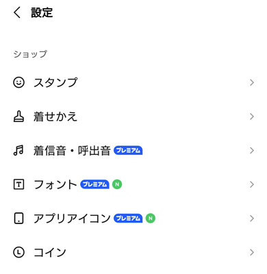
Messaging platforms frequently offer this functionality. As reported by ITmedia regarding corporate app customization trends, services like LINE allow users to navigate to Home → Settings → App Icon to select from a catalog of official alternative graphics, switching from standard branding to boutique designs with a single tap.
Platform redesigns often cause friction. When social platform X dropped its legacy bird emblem and later added textured glass-crack patterns to its dark icon background, millions of users turned to the Shortcuts workflow specifically to restore traditional visual assets. Checking software preferences first can save hours of manual Shortcuts configuration. Popular tools like Carrot Weather, Slack, Discord, and Telegram also feature deep catalogs of alternate app badges for standard and premium subscribers.
Automating Wallpapers and Widgets for Dynamic Theming
A custom icon configuration loses its visual impact when paired with a mismatched wallpaper. Setting up wallpaper automation on iPadOS ties your iconography, widgets, and backdrop into a coordinated system that responds to your physical environment and daily schedule.
As detailed in an MSN operational guide covering multi-stage iPad personalization, integrating wallpaper automation with Focus modes allows your workspace to transform automatically throughout the day:
- Open Settings → Focus.
- Select an existing profile (such as Work or Personal) or create a custom profile.
- Under the Customize Screens panel, tap Choose under the Home Screen or Lock Screen mockup.
- Link a dedicated page containing your curated aesthetic home screen widgets and customized icon layouts to that specific Focus profile.
By pairing custom icon pages with specific Focus triggers, a single iPad can shift between an uncluttered, high-contrast monochrome design during business hours and a relaxed, artistic layout in the evening. Combining freeform grid placement, native color matching, and Shortcut mapping turns the iPad from a static app launcher into a refined, tailored digital environment.
Frequently Asked Questions (FAQ)
Q1: Why do custom shortcut icons stop showing notification badges?
A1: Shortcut bookmarks placed on the home screen are pointers to automated commands, not native application binaries. Apple's system architecture restricts push notification badges exclusively to actual installed applications, meaning custom Shortcut aliases cannot display unread message counters.
Q2: Can I remove the text labels under my iPad icons without using Shortcuts?
A2: Yes. In iPadOS 18, long-press the home screen, tap Edit → Customize, and select the Large icon option. This enlarges the icon footprints slightly and strips away all application and folder text labels across the entire interface natively.
Q3: Does launching apps through Apple Shortcuts slow down my iPad?
A3: The performance impact is minimal on modern Apple Silicon hardware (M1 through M4 chips), but there is a slight behavioral difference. Instead of launching instantly into the app frame, iPadOS fires the background script and shows a small drop-down confirmation banner, creating a fractional delay compared to opening apps via native icons.
The Evolution of Tablet Personalization
The interface changes across iPadOS 18 mark a decisive shift in Apple's software design philosophy. For years, the operating system treated the iPad as an oversized phone screen, locking software into rigid layouts regardless of whether the user held an 8.3-inch iPad mini or worked on a 13-inch iPad Pro with a keyboard and trackpad.
By combining unconstrained grid placement with native color washes and flexible automation pipelines, the platform now provides the visual control creative professionals and casual users have requested for years. Whether you deploy a quick single-color wash to match a seasonal wallpaper or assemble a gallery of custom icon PNG assets via the Shortcuts engine, the iPad home screen now bends to your organizational preferences rather than dictating them.
